Everyone has decorated memory about his or her first computer like her or his first car. Mine was the Power Macintosh 6100/66AV from Apple Computer in 1995. The flat beige box was quite expensive compared to the common x86 towers of that era, but I have been happy with that for 7 years without any extra cost while my friends’ other Wintel machines were rapidly hacked, thrown and replaced.
Initially installed the System 7, it has turned lovely. Using Chicago typeface as a default operating system font, every text on the bespoke Trinitron display appeared clearly legible. In 1997, two years later from its arrival on my desk, Apple released the whole new version of the renamed operating system, the Mac OS 8. Then, besides its technical improvement for the last processors from the PowerPC alliance and its Platinum look, Apple replaced good old Chicago with newly designed Charcoal typeface at that moment.
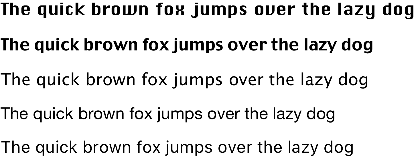
I always think that Chicago is a kind of fatten DIN typeface for the low-resolution CRT (cathode-ray tube) display because of its bold stem and bowl, widely opened aperture, excessive x-height and squared V, W and O. However, when I met Charcoal, the letterform reminded me a muscled Optima, one of the most popular Humanist sans-serif typeface. Fully splayed V, W and O refers its inspiration from the Roman capitals, rather than geometrical composition shown on Chicago. That might be why Charcoal had been highly demanded also for the letterpress printing at that time.
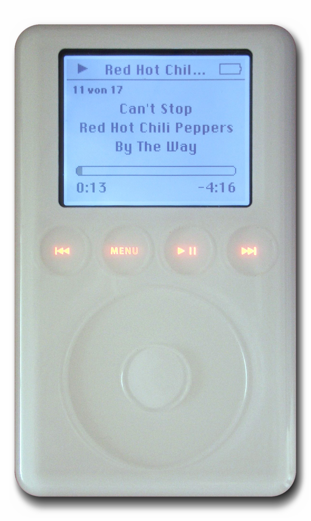
Charcoal later left the menu to Lucida Grande, and it’s now San Francisco’s, after the short tenure of Helvetica Neue. Nevertheless, Apple couldn’t just burrow the legacy typefaces even after the Mac OS X, because of an up-and-coming mobile device named iPod. It had a 2″ monochrome LCD (Liquid Crystal Display) with 160 x 128 resolution and 0.24 mm dot pitch; Chicago had been reused for iPod navigation until the appearance of the iPod with color display. However, Charcoal never made its comeback; Podium Sans under Myriad tag had displaced Chicago for the color display iPod.


I always liked Chicago, but don’t trust me for typefaces; I also like Comic Sans. Just sayin’.
LikeLike